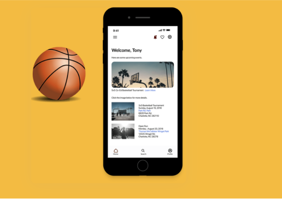
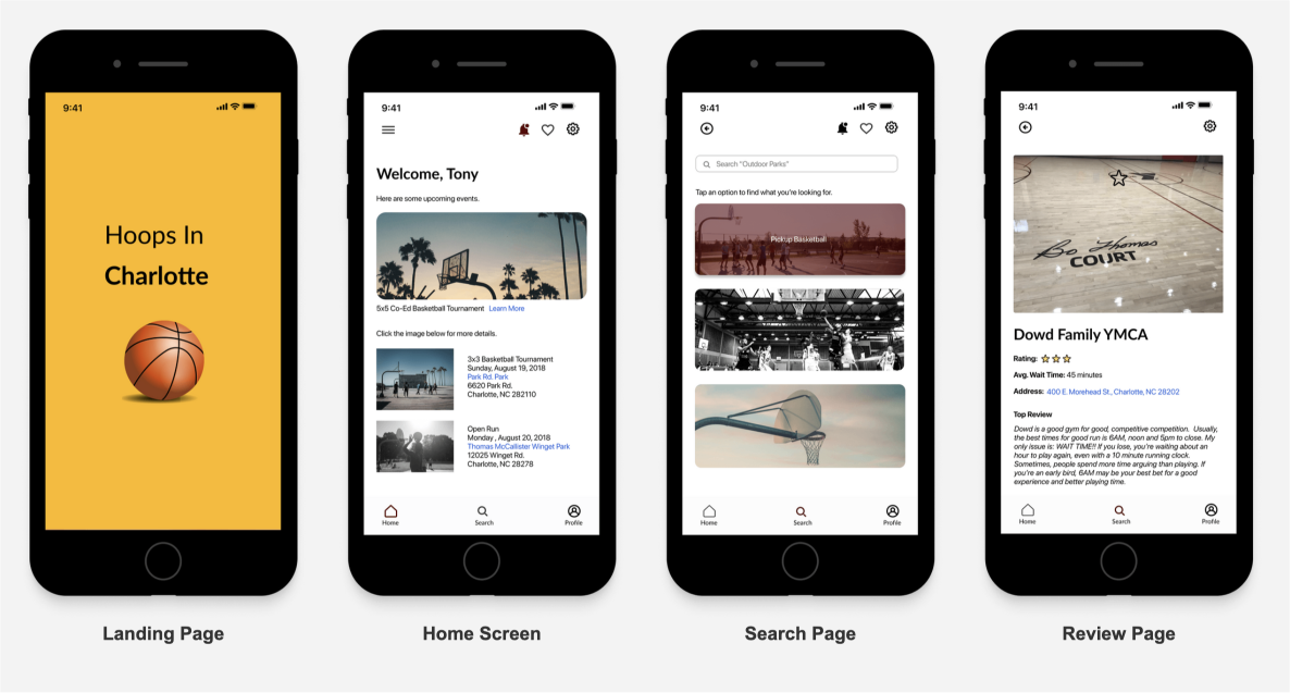
Hoops in Charlotte

UX Case Study

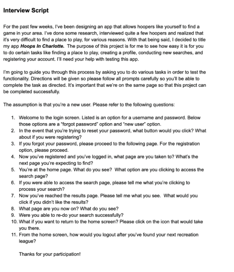
Finding a place to play basketball in the Charlotte area was difficult for a lot of players. I used data from primary and secondary research to design a mobile application that would make it easier for basketball players to find a place to play.

Role
UX Designer
Team
Solo Designer
Winton Brown
Duration
6 Months
Tools Used
Problem
Being new to the Charlotte area, I found it very difficult to find a place to play basketball. I struggled to find good men’s leagues, parks and open run opportunities. After connecting with friends and colleagues, it appeared that they had the same issues. They tried to leverage Google and social media to find places to play, but didn’t have much success.  How might I create a solution that provides athletes with the opportunity to find their preferred style of basketball?
Key Drivers
Finding a place to play basketball in Charlotte was a difficult task for many athletes who were looking for a league to play in competitively, for recreation, or just find a park to shoot around. There was a clear need to provide locals with the opportunity to find places to play. Some key drivers were:
Outdated and inaccurate information on current platforms (i.e. Facebook, Google searches, discussion boards). The need for a quick way to locate different basketball opportunities based on preferred style of play.
The desire to build positive connections through various styles of basketball.
Discovery
Research
I conducted a survey on basketball players. I felt that a survey would provide me with quantitative data that would help me in my process. My objective was to learn more about how often they play, their preferred style of play and how they find opportunities to play in order to build an app that would fulfill their need.
Empathizing
After the surveys, I wanted to look into the potential user. I wanted to gain an understanding of the following: What does the everyday basketball player look like? Who will be the ones who benefit from this app the most? 
Through the creation of empathy maps, I gained insight on the user's pain points and their wants and needs. Once that was completed, I created personas to illustrate user's feedback.
Ideation
Information Architecture
After I obtained information about the user and their needs, the strategizing process began. I created a card sorting activity first to gain knowledge of how the users would group particular basketball terms.  Then, I created user flows.  I wanted to see how this could be an easy app for users to find what they are ultimately looking for, which is to find a place to play.
Iteration Phase
Design Process
With the feedback generated from user stories and the user flows, I created wireframes. I chose to do low-fidelity wireframes to jumpstart the design process. Lo-fidelity wireframes were important to visualize a cohesive mobile layout that addressed the needs of the users.
Branding
After my sketching and initial iterations, I focused on the design. Since the app is for everyone, one of my objectives was to create a look that was gender-neutral. I selected a color palette that had visually appealing colors that would fit the look. I chose Lato (H1 and H2) and San Fran (H3-H6) for the fonts because they are clean and modern.
Testing
Usability Testing
I set up usability tests with 5-7 users who I felt would benefit from this app as well as provide honest feedback. My goals of this testing session were:
  • To validate if they could successfully find a place to play
  • To validate if they could find detailed information on the selected place / style of play
  • To validate if they felt that having reviews of leagues, parks, etc. would help them make informed decisions on where to play
Final Designs
After conduction usability testing, I leveraged user feedback to generate a final iteration. The following screens are:
‍
Takeaways
Coming up with a solid design that was up to standard was difficult. However, I wanted to focus more on usability than look. Being able to conduct interviews, gather feedback, pick branding, and synthesizing the data to create an initial layout was very fulfilling. Even though this met the user’s needs, I will continue to iterate on this to make it better.